Composition in Landscape Photography: The Essential Guide
Photography is an art and as such composing an image is a matter of personal taste. There are many ways of using composition in landscape photography, and to help keep us on track there are a number of different “rules” that can be applied in most situations. These landscape composition rules are a starting point, giving us a foundation on which we will eventually build our own interpretation and style.
Composition Rules in Landscape Photography
It stands to reason that the rules of composition are most useful for people starting out in photography, but they are also important for the more experienced photographers since they give us an opportunity to reflect on our work in an informed way.
1. Rule of Thirds
The Rule of Thirds is very simple. Just imagine a grid of 9 rectangles on your image and try to compose the photo so that the main points are situated on those lines – or better still at the point where two lines intersect.
Generally, when following the Rule of Thirds, I would aim to place the bottom of the horizon on the top third line (occasionally the bottom third) and put a focal point on the top left or top right intersection of thirds. I would then try to find a secondary point of interest and place that on the diagonally opposite intersection of thirds. This creates a diagonal within the photo which tends to add depth.


It might be because this rule is so simple that many photographers want to look for something more complicated, but simplicity is often key to a good composition; the old adage “less is more” can be a useful one to keep in mind.
I tend to like focal points to be slightly closer to the edge of the frame than the Rule of Thirds would suggest. But on a practical note, having the focal points too close to the edge of the frame when capturing the photo in camera is a mistake. If the photo needs to be cropped for printing, or use in a magazine, it needs more space around it so following the Rule of Thirds has served me well over the years.
2. Golden Ratio and Golden Spiral
The Golden Ratio can be seen in nature and it has been used by us, either consciously or subconsciously, in architecture and art dating for a long time. When key elements of a painting, building, or photograph are positioned in the Golden Ratio they are thought to be as aesthetically pleasing as possible.
So what is the Golden Ratio? The numerical value of the Golden Ratio was established by a mathematician called Fibonacci who was looking for a mathematical explanation for the aesthetics of art and design.
He proposed that if we begin with a rectangle that has dimensions which are in the Golden Ratio (known as a Golden Rectangle) and we cut a square off one end then we are left with another Golden Rectangle. As a result, this smaller rectangle can also be split into a square and an even smaller Golden Rectangle, and so it goes on.

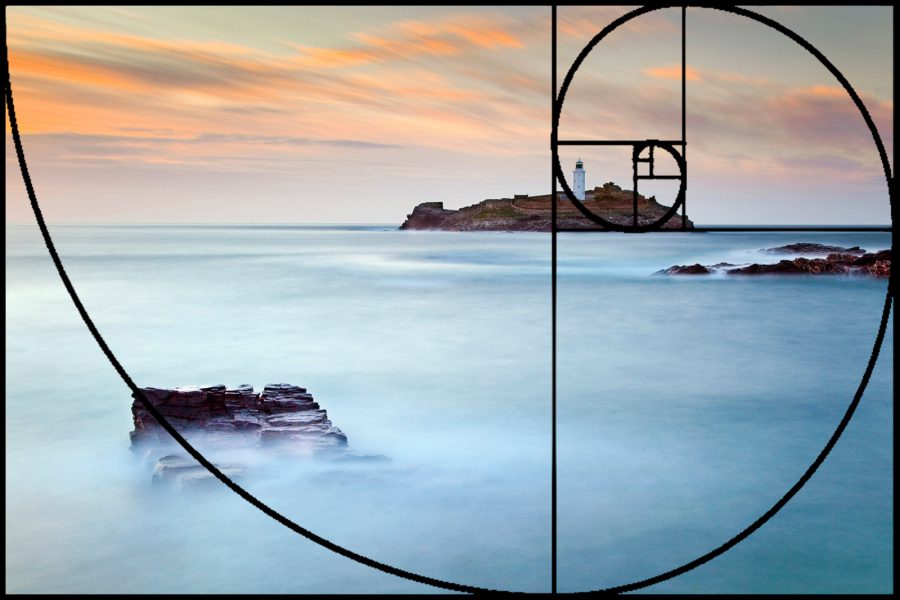
Fibonacci’s Golden Rectangle has sides in the ratio 1.618:1 (approximately) and this is known as the Golden Ratio – also known as divine proportion, golden mean, or golden section. The Golden Spiral is found by connecting the corners of the squares with a curve to create an aesthetically perfect spiral of points.


There is a slight problem with the application of the Golden Spiral to images captured on digital cameras because the frame dimensions from a DSLR are 3:2. This is not a Golden Rectangle so the diagrams appertaining to the Golden Spiral in this article (and that of most others on-line) are approximate.
When composing a photo with the Golden Ratio in mind, we should place the horizon on the dominant horizontal line and use the disappearing point of the Golden Spiral on which to position the focal point. But remember that this spiral can be placed in one of four orientations on your image and so you get four options, just like the Rule of Thirds!
This photo of Porthcurno Beach in Cornwall has a well-placed horizon and a curving wave which mimics the shape of the Golden Spiral to lead into the photo.
The photo of Godrevy works well with the Golden Ratio and Spiral, notably the horizon is on the longest horizontal line and the lighthouse is close to the disappearing point. Note also that the rock is on the spiral.
The horizon is slightly closer to the middle of the photo when following the Golden Ratio than it is with the Rule of Thirds. You can see the two rules overlaid below:
The Golden Spiral encourages us to think about a lead-in line from the bottom or top corner which curves its way beautifully into the frame and ultimately to the focal point, leading the eye around the frame in such a way as a good proportion of the image is covered.
This coastal image of Cape Cornwall was improved by using the headland to give something other than just sea in the left of the photo and you can see that this does work well with the Golden Spiral.
3. Lead-in Lines and Diagonals
Lead-in lines and diagonals are a way of enticing the eye into and around the image. In a sense, the more of the image that we are guided around the more interest there will be. Lead-in lines work best if they connect the foreground to the background and they shouldn’t lead the eye out of the frame. So, for example, a wall or river should end within the frame or turn and lead back in again.
Learn more: Lead-in lines and vanishing points

Paths, rivers, roads, walls, and whole host of other physical features can be used to lead the eye into the picture. Using a slow shutter speed on waves as they ebb can also create pleasing lines leading from the corners of the image.
Diagonals and lead-ins are not necessarily restricted to the foreground. Slower shutter speeds can create movement in the clouds which leads the eye towards the focal point, or sometimes we get lucky and find a sky with diagonal patterns in it just waiting to be captured.

Other Ideas for Landscape Composition
It is acceptable to put reflections across the middle of a photo, but try to offset the main focal point to one side or the other. Simplifying the picture can make for a stronger composition too, so don’t include too many elements.
The framing of a subject can also work well. I often use trees to frame a focal point when the sky is bland but many elements can form a frame – rainbows, clouds, archways, and doors are just some ideas.
Learn more: Creating a Frame in Your Composition

Gateways can be used to invite the eye into a photo; consider whether the gate should be open or closed! Try using repeating patterns to fill a frame, as this can turn a landscape photo into more of an abstract image.

Look for shapes in the foreground which replicate shapes in the background. In fact, it doesn’t have to be shapes, and other factors including colour tones, light, or textures can bring the image together.

Don’t Overdo It
We should all be aware of the rules of composition, but there is a danger of over-thinking an image.
Photographer Edward Weston once said, “To consult the rules of composition before making a picture is a little like consulting the law of gravitation before going for a walk.”
He is suggesting we should have a feeling for composition. We shouldn’t have to think about rules all the time, and instead we should just create an image which pleases us. He has a point, but then he was probably already an accomplished, confident artist when he penned that quote.
The great Ansel Adams said, “You don’t take a photograph, you make it.”
Both Weston and Adams agree about ‘making’ rather than ‘taking’ a photograph, and it would be hard to disagree. Understanding that we ‘make’ an image will encourage us to stop and consider the elements available to us. We mustn’t just take a photo from the position that we first spot the opportunity – that would be a ‘snap’. As artists, we are better than that.
When we see a landscape we must consider the options: look for foreground, see how the foreground and background work together, maybe wait for the right light, or come back again at a different time. We should try a higher viewpoint, or lower, and venture left a little or further to the right. How do the different positions change the way in which the foreground and background work together?
What is important is that we take control, we construct the image, and that ultimately we find a landscape composition to satisfy ourselves.
